Work | Canopy
Organic and Optimistic: The Architecture of a Brand

about the studio
Founded in 2009 on the principle that good design can be achieved in any context, Canopy / Architecture and Design’s projects range from residential to commercial to planning and urban design. Whether it’s a home or multi-use facility, the context, the core elements that bind people and place, is important. Canopy lives to imagine, develop and create places where people live, meet, learn, and, ultimately, connect together. - From Canopy’s website
about the ask
Having reached the notable milestone of a decade in business, combined with preparing to undertake an office relocation to Chicago’s downtown loop, we met with Canopy to discuss a brand refresh collaboration that would celebrate the values and history of the studio, reflect its growth and achievements to date, and create excitement for the decade ahead while establishing increased consistency in its visual identity.
Services
Brand Strategy
Logo Design
Print Collateral
Digital Templates
Brand Style Sheet


Brand Strategy
We began this engagement by conducting a number of branding strategy workshops with the studio team members to articulate Canopy’s brand pillars - Community, Sustainability, Knowledge, Empathy, Respect, Affordability, and Stewardship. From there we completed a visual identity analysis of the Chicago architecture studio landscape. From that analysis it was evident that the two foundational components for crafting our strategy were the use of color, expressly, finding the right shade of pink, which has been deeply embedded in Canopy’s visual identity since its founding, and then building a fuller and complementary color palette to enhance it; and highlighting the importance of the studio’s name and all that it represents to their practice. With so many other firms taking the names of their founders and principals, the name Canopy stands out, and we wanted their refreshed visual identity to reflect the progressive, insightful, and thoughtful nature of the studio and its projects.
With that platform established, we crafted three moodboards as tools for reflection and discussion. These moodboards evoked specific feelings meant to push the team and shape their brand identity . The first, Progressive and Pronounced, was rooted in an ultra modern aesthetic and bold color. Next was Color and Context, built on the studio’s commitment to research and informed by the street art, bright colors, graphic patterns, and strong typography common in the neighborhoods where they predominately work . The third and final direction, Organic and Optimistic, expressed a more tonal color palette, organic shapes and textures, and emphasized a deep connection between the environment and live/work spaces. Ultimately, it was this third moodboard that Canopy felt not only reflected the maturity they had achieved as a studio, but would carry them forward into the next chapter of their evolution.
Brand Values
Community
Sustainability
Knowledge
Empathy
Respect
Affordability
Stewardship
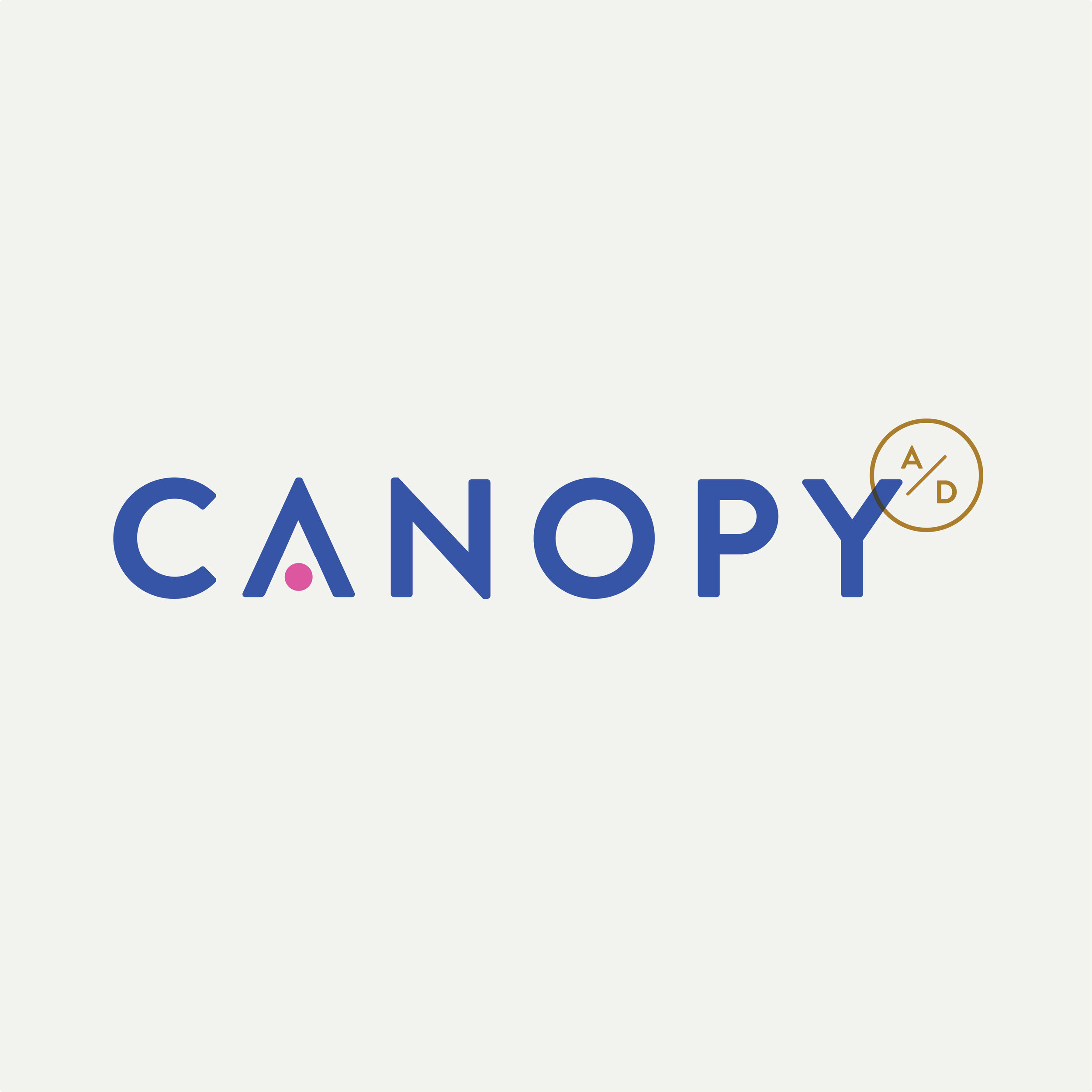
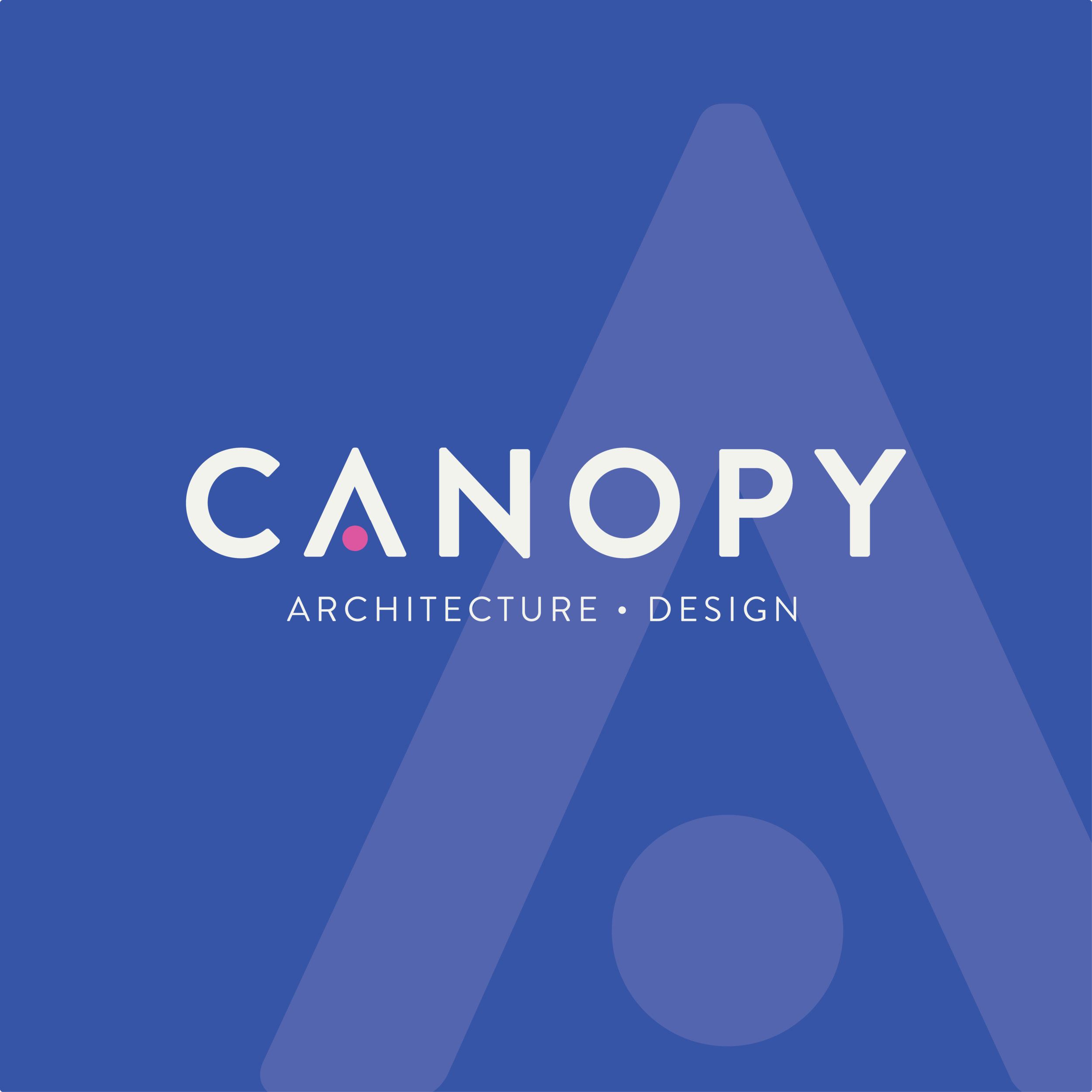
Logo DESIGN
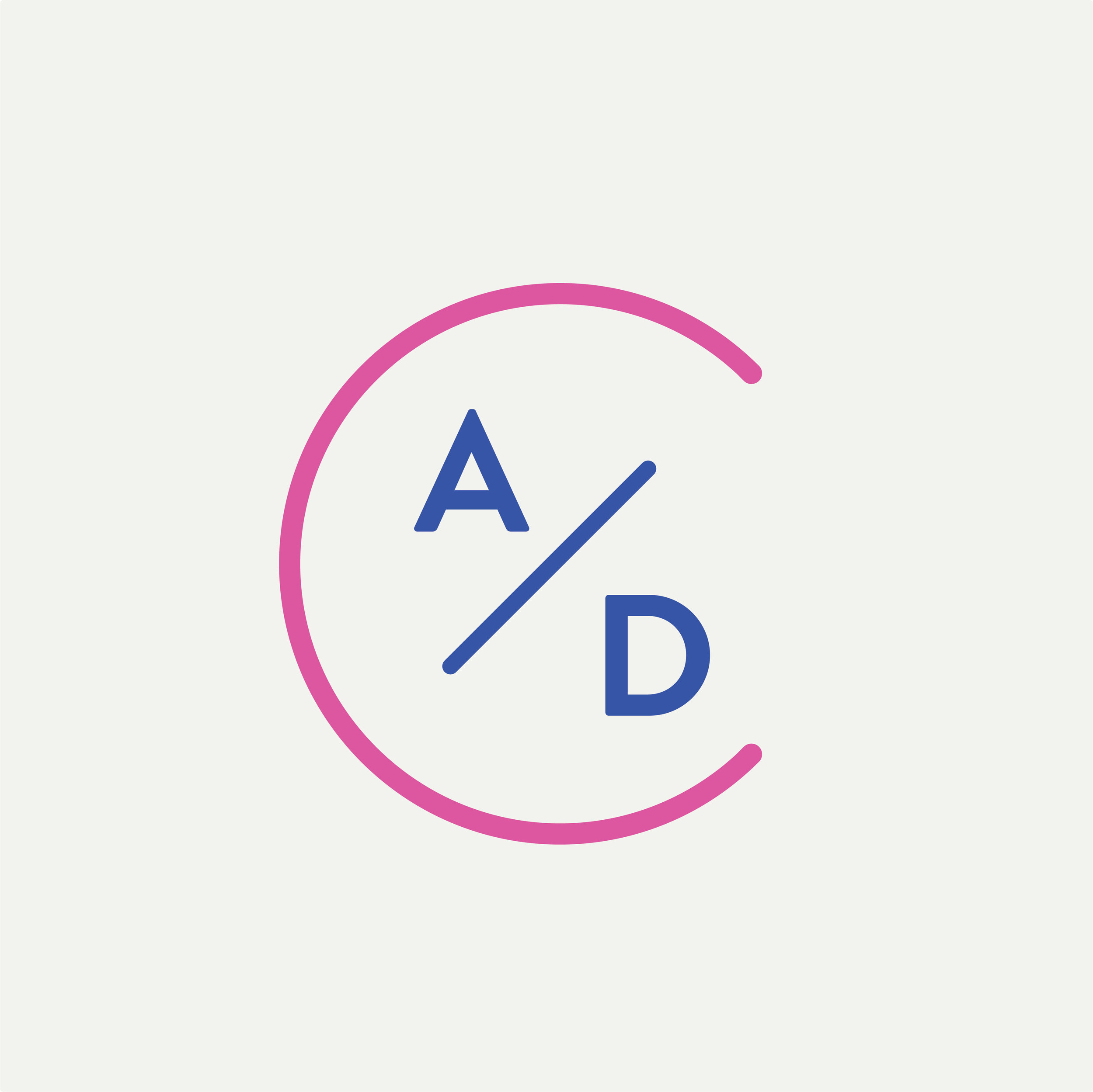
As the most visible expression of this refreshed brand identity, we crafted a logo suite that captured the essence of the studio name, while maintaining a focus on color and it’s role in the studio’s history. We ultimately landed on a clean, strong word mark with slightly rounded corners to increase approachability and stay in line with the selected moodboard. The A is customized to represent a shelter and inhabitant, with the A/D incorporated as reference to a maker’s mark, its placement on the Y also creating visual connections to a tree form. Lastly, joining Architecture and Design with a bullet point and slash in lieu of a + sign or ampersand highlights that they are equal components of the studio’s process and work.


Collateral
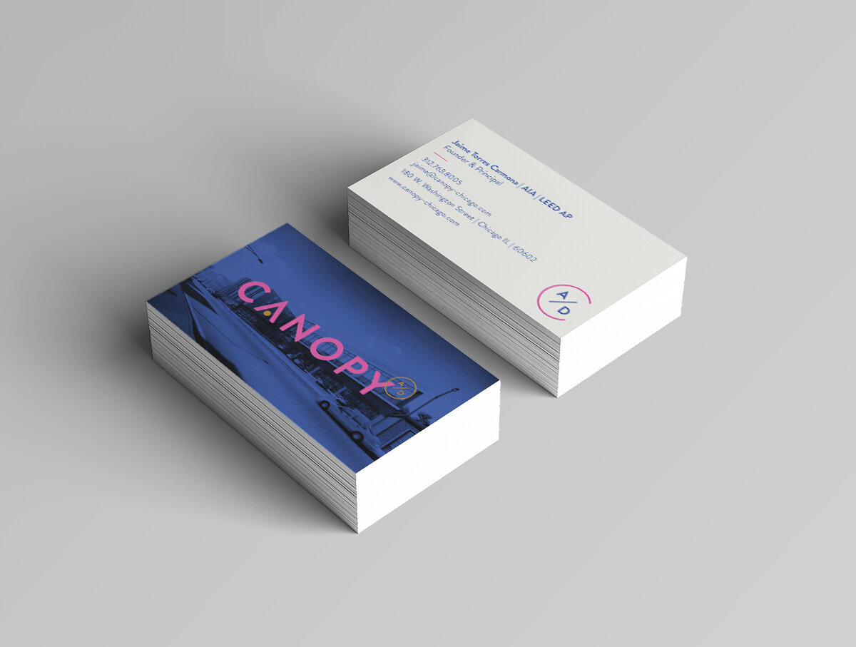
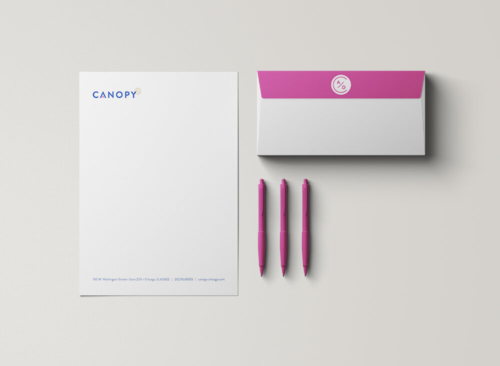
For every business each touchpoint with colleagues, clients, and partners represents an opportunity to connect and make a statement about the strength of its brand. For Canopy, celebrating 10 years in business and introducing a new logo, it was especially important to design a suite of brand collateral that lived up to the momentous occasion. We understood the importance of consistency among both printed and digital touchpoints and ensured a cohesive look and feel across business cards, letterhead, envelopes, email signatures, and digital templates. With intentional design decisions and careful planning we helped Canopy roll out a refreshed brand across multiple channels while providing them flexible assets and documentation to continue moving forward.
Business Card
Letterhead
Envelope
Email Signature
Digital Templates


The Outcome
We set out to ensure this brand refresh would accomplish three objectives: stay true to the Canopy’s origins while focusing on the future; reflect the natural maturation process of an architecture studio that, in its ten years of practice, has established its itself among Chicago’s architecture landscape as being progressive, investigative, and thoughtful; and, ultimately, provide clarity and consistency to a growing studio’s visual identity. We successfully met those objectives and have given Canopy an updated look that will help to seamlessly move its story forward.
“You don’t know how much we love our new logo. Thank you, Medley!”