Work | CRISTO REY NETWORK Brand Refresh
A Fresh Look at an Established Identity

THE ASK
With an innovative approach to education unlike any other private network of high schools in the country, the Cristo Rey brand is well-established. However, it had been over 10 years since it last underwent the process of revisiting its logo and collateral pieces, done in conjunction with its move from a small office across the street from the school in Pilsen to a Chicago Loop address. In that time, the Network has grown from 19 to 37 schools. It seemed natural to use the occasion of the Cristo Rey Network’s current office relocation to once again revisit key components of its brand and visual identity pieces to reflect that growth. So we set about putting together some refreshed designs to mark a new period in the organization’s evolution and development that would build upon the excitement around the new space and its versatility.
Services
Brand Strategy
Identity Design
Print Collateral
Printer Sourcing & Management


logo
With a well-established brand such as Cristo Rey that extends beyond the National Office in Chicago to the local school level throughout the country, approaching ways to refresh its logo and usage comes with certain limitations and needs to be handled carefully. Making any significant update would necessitate filtering those changes down throughout and across the existing schools, which, realistically speaking, is not a feasible undertaking without significant planning and lead-time for a structured and cohesive rollout.
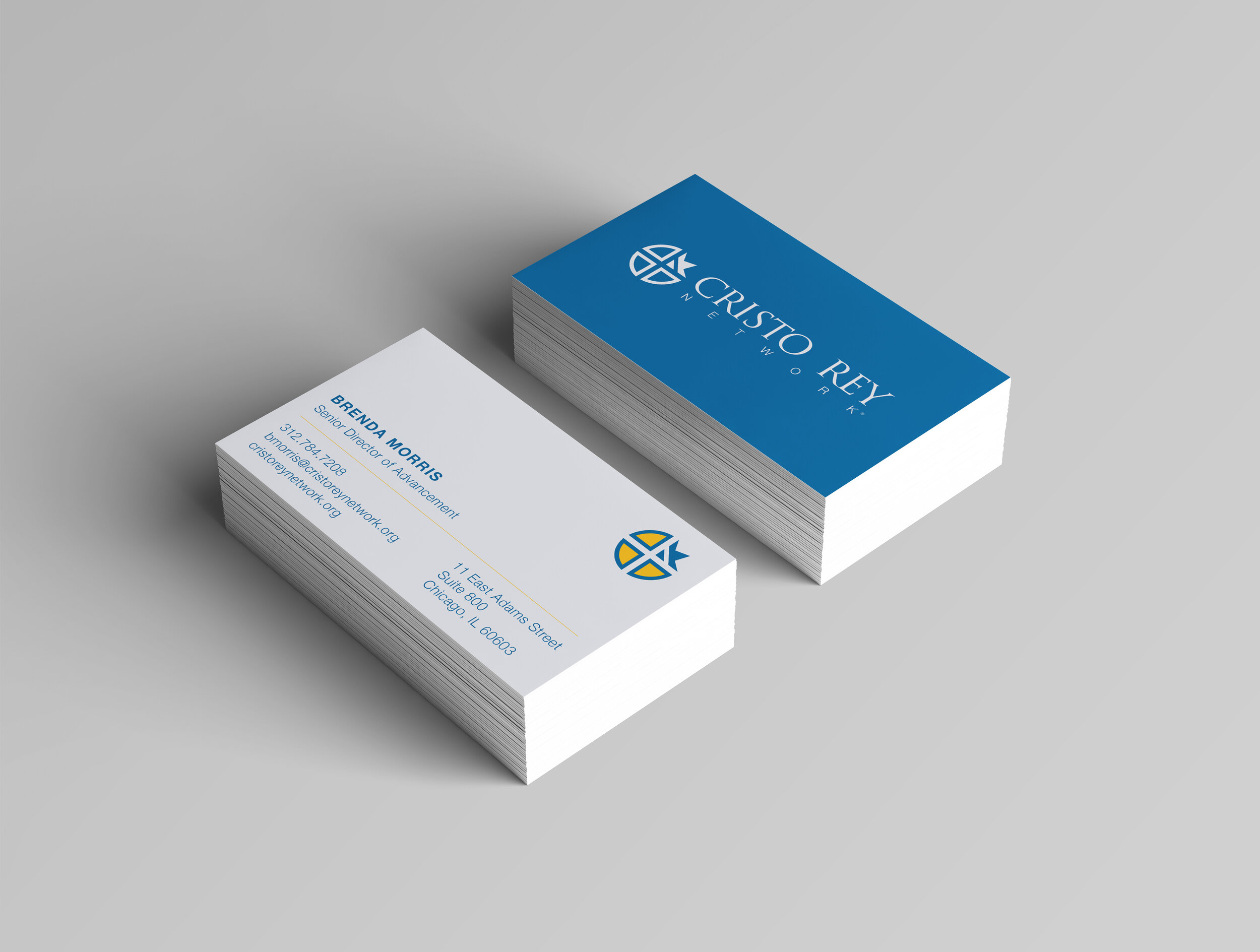
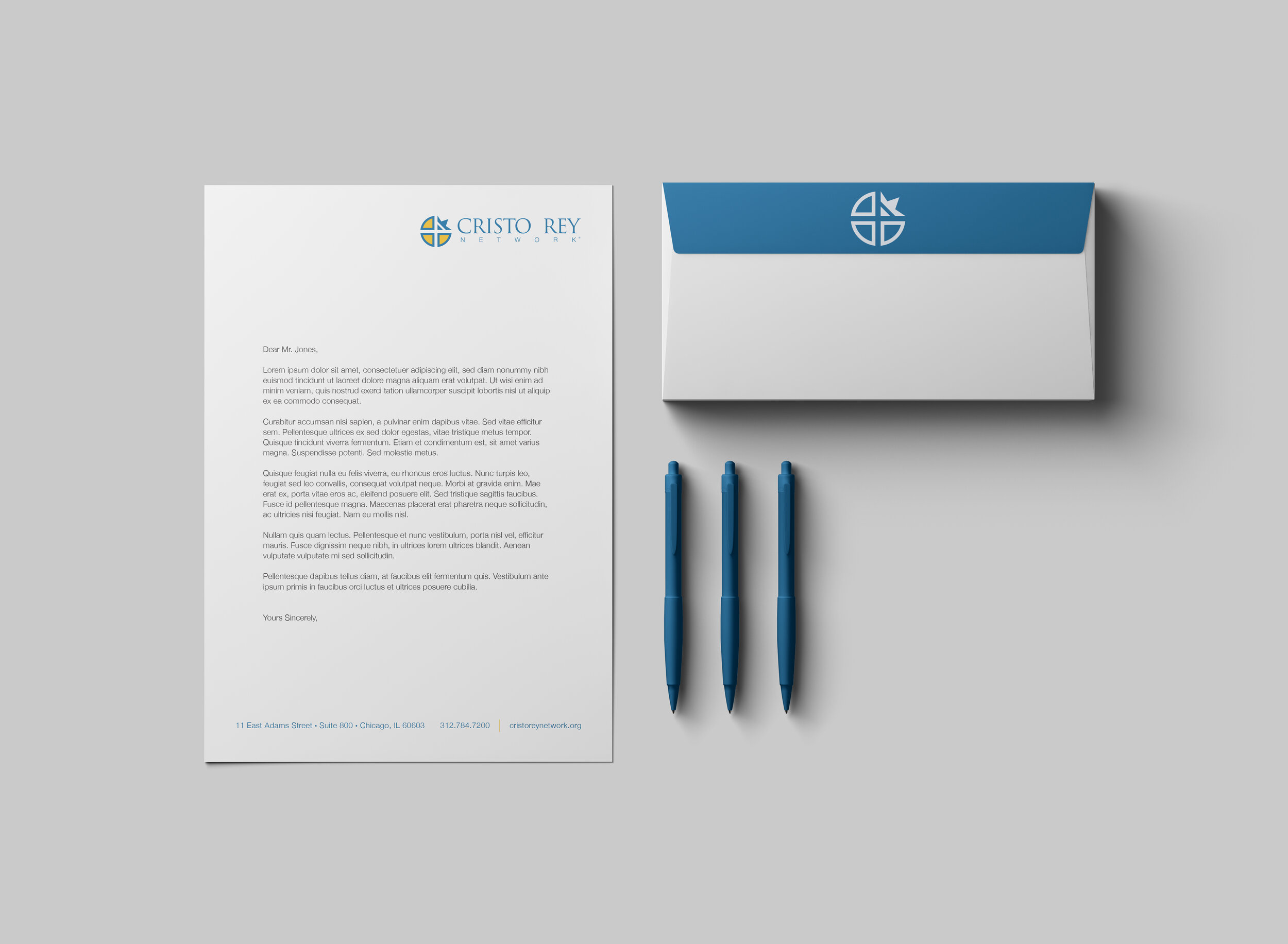
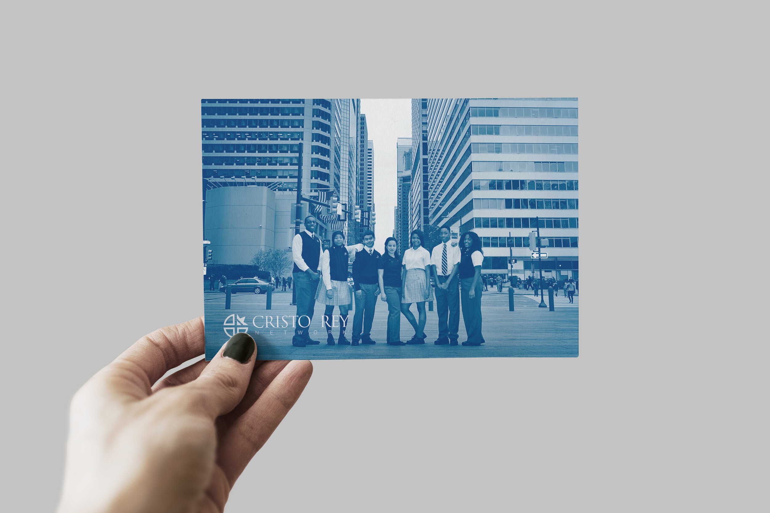
Instead, we approached their existing visual identity with an eye toward emphasizing the more modern and versatile 2-color, flat version of the primary logo, and pulling out and highlighting the more compelling and impactful components, such as the crest. In this case, it’s as much about reconfiguring and repurposing what’s already there for a fresh take on an established identity, and how that then translates across digital and print mediums.
Print Collateral
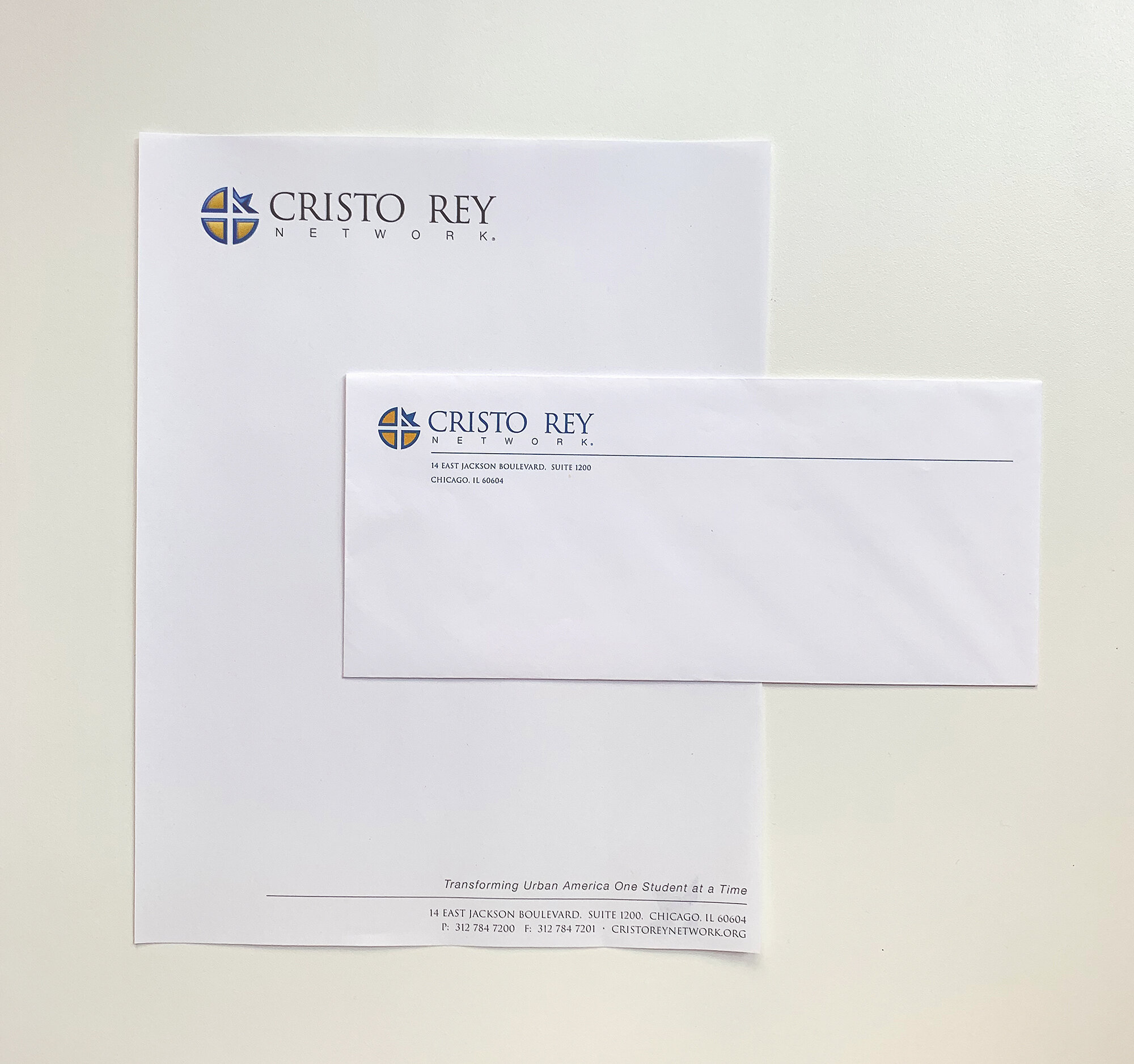
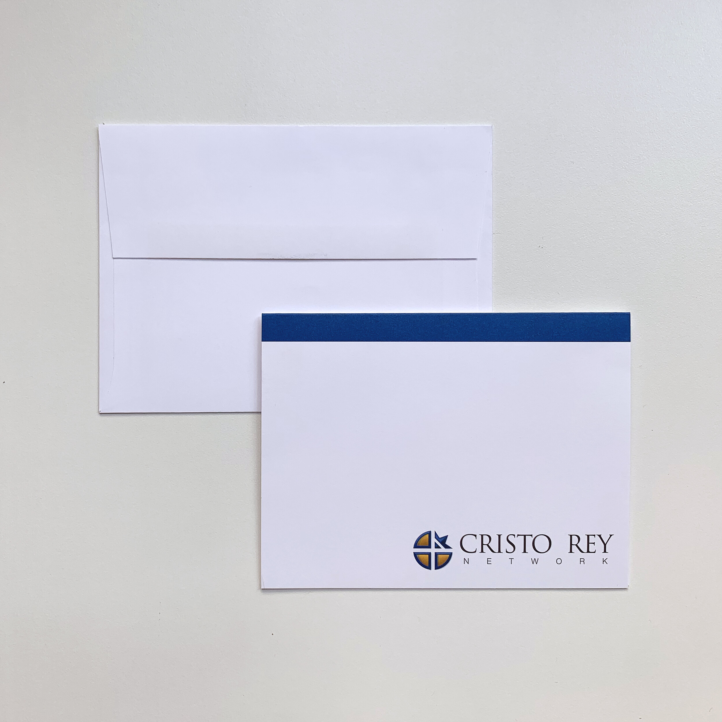
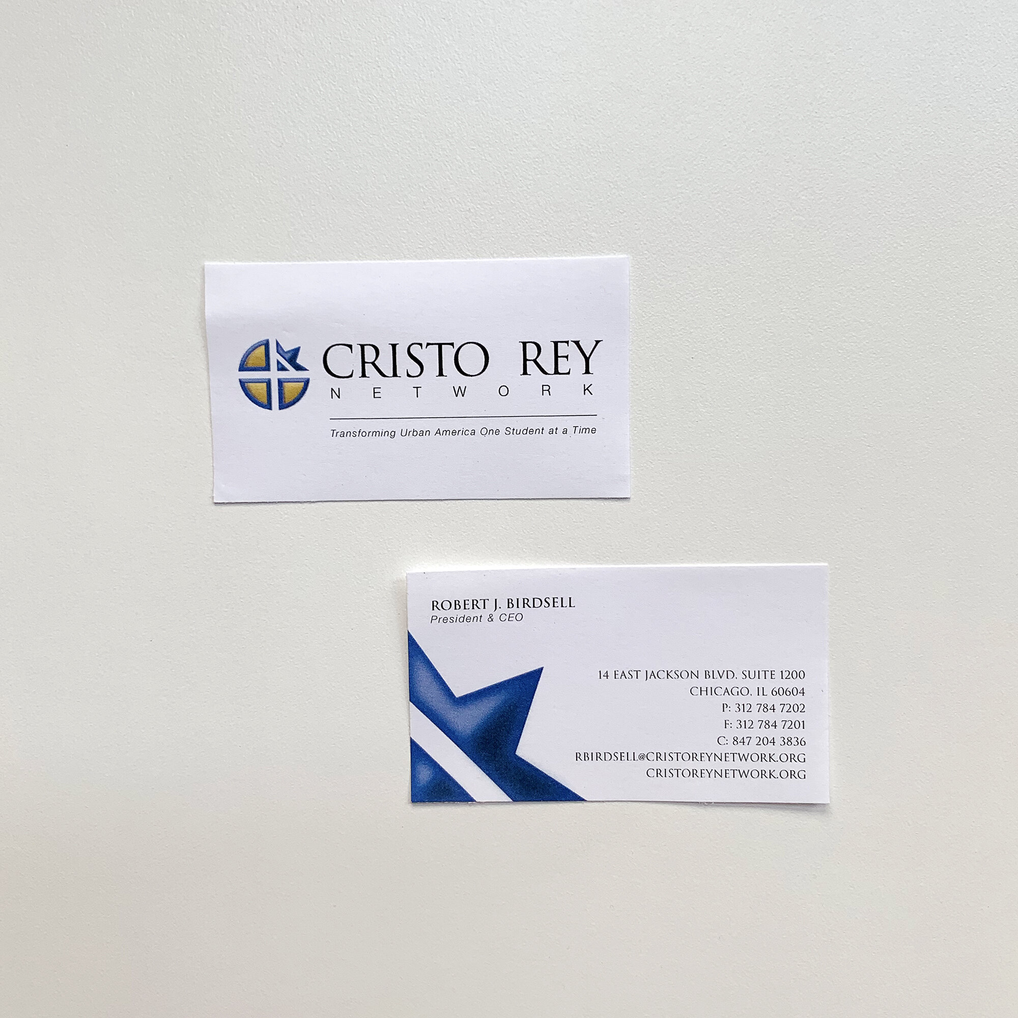
Adding a new address to existing materials is certainly cost-effective approach as it’s only a matter of printing costs, but in this instance would have been missing the opportunity to showcase and emphasize their new location, its purpose, and . Each and every touchpoint with colleagues, donors, and friends is an opportunity to connect and make a statement about the strength of your brand identity. As with the office design process, we conducted background research and presented inspiration for collateral directions, and settled on a scope and general aesthetic.
Items Designed
Business Cards
Letterhead
Envelope
Postcards
Folder
Old Collateral
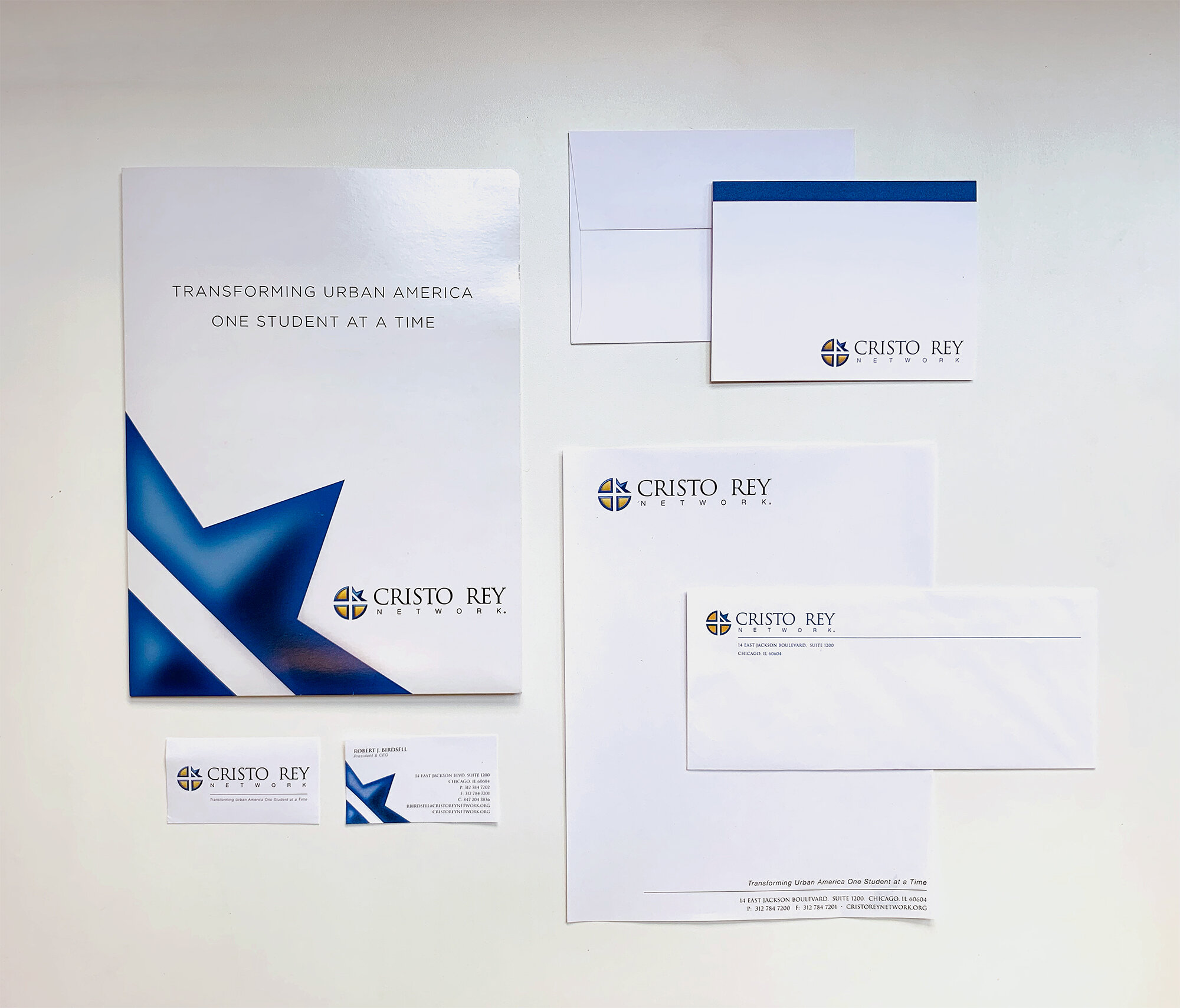
Updated Collateral