Establishing An Identity: Crafting a Logo
After reading our last post, you know that a lot went into just naming our business. Patrick and I spent many hours working through branding exercises to better understand our vision, mission, and values. We then spent many more hours working through name options that we hoped would not only encompass our brand pillars and promise, but also be commercially available. Once we settled on the name Medley, we were pretty confident in our decision. Now came the task of building our brand’s visual identity and tone of voice.
We agreed early on that our core values would include partnership, creativity, intentionality, and keeping a growth mindset. I was tasked with representing those values visually. So, I started by creating a brand essence moodboard...

Brand Essence Board
I used this mood to initiate a conversation with Patrick, and clarification for myself, as to companies, organizations, and people we were drawn to for one reason or another and try to identify what that reason was and how it came to life in these examples. Patrick had provided companies like Original Penguin, Shinola, and Collectivo Coffee, along with music groups like The Strokes. I included Patagonia, Toms, John Lennon, Audrey Hepburn, and To Kill a Mockingbird.
While discussing the board we discovered a strong commonality among the elements was an authenticity that we wanted to emulate with our brand. We appreciated the time-worn characteristics of places, spaces and people that show a life well-lived and a legacy well-loved. We gravitated toward deep, rich tones, lightly accented by bright warm tones. We wanted our tone of voice to be honest, approachable, and to contain just the right amount of wit. Most of all, we wanted our brand to represent our intent - to partner with like-minded organizations and try and do a little bit of good.
Now, it was back to me to work through some more specific moodboards to represent actual possibilities for what our visual identity could look like, while ensuring it represented the values we spent so much time identifying.
Option 1 :: Quality

Quality Moodboard
The first moodboard I put together focused on the idea of quality. Rich navy and cream, accented with bright red and gold, bold script and slab serif typefaces, all come together in a way reminiscent of brands that have been around for generations and were made to last. I wanted to emphasize the notion that we bring quality work to each and every client relationship.
Option 2 :: Bright Ideas

Bright Ideas Moodboard
The second moodboard i put together was a bit bolder than I think either Patrick or I had originally envisioned for our brand, but I got inspired by the concept of bringing bright ideas and fresh thinking to organizations that may be stuck in their ways a bit. This moodboard was centered around bright colors grounded in deep indigo, modern illustrations and geometric patterns, and bold typography.
Option 3 :: Partnership

Partnership Moodboard
The final moodboard I put together was crafted around the central theme of partnership. This moodboard was not as bold as the other two, but more refined and elegant. In execution it would allow the work we create with our clients to shine through and take center stage because, at the end of the day, our job is to highlight the amazing work our clients do on a daily basis. After sitting with all three moodboards for a few days, sharing them with a couple of trusted advisors, and more conversations among Patrick and I, we ultimately decided that moodboard #3 and the theme of partnership was the foundation upon which we wanted to build our brand.
Next came one of my favorite parts of any branding process - logo sketching. I like to start sketching on paper and will doodle logo ideas in margins, on the back of napkins, even my hand - whatever happens to be around when inspiration hits.
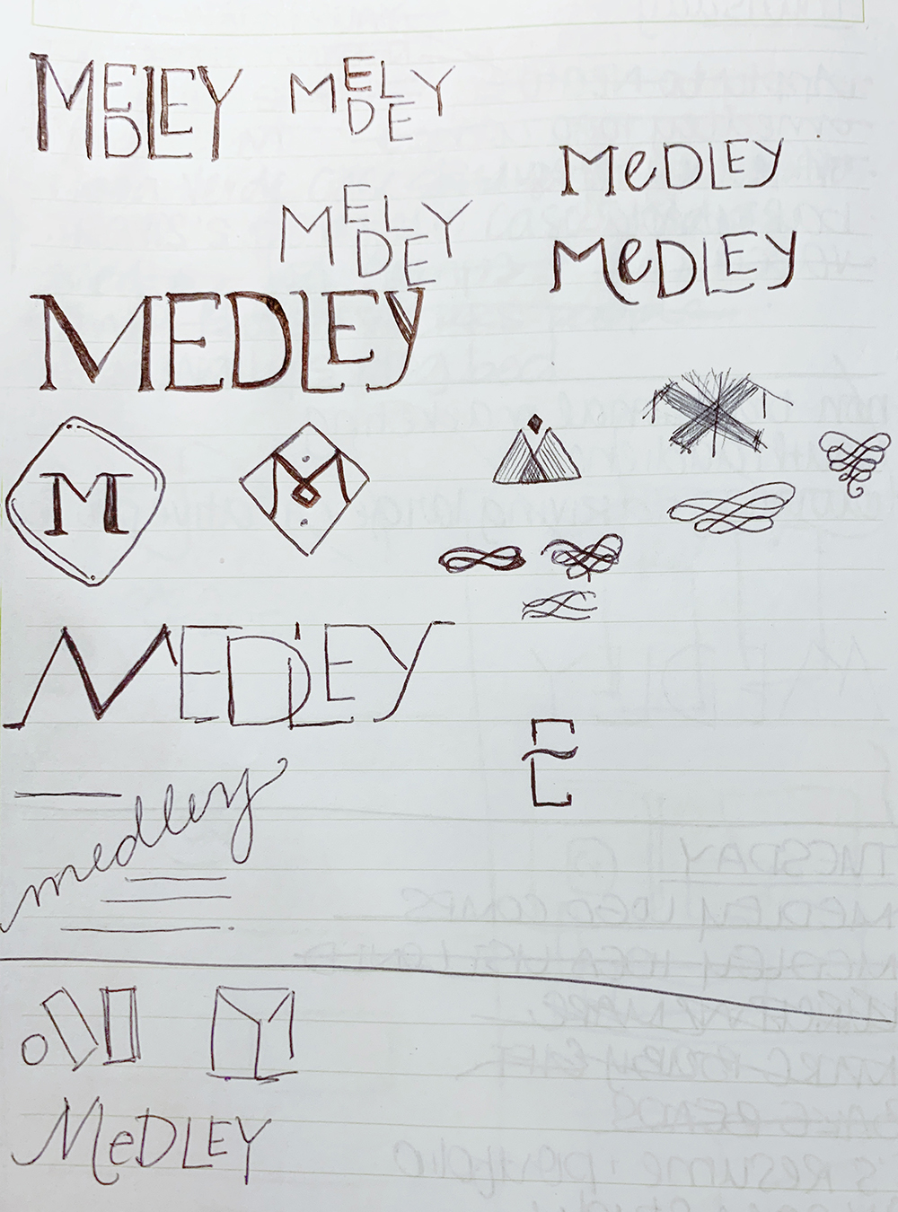
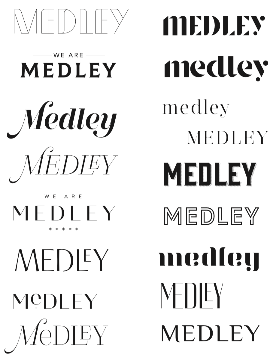
After some very quick sketches to get some different possible directions down on paper I move onto the computer. Once I am working in Adobe Illustrator, it makes it easy to move elements around and explore a number of typefaces, to push the boundaries of any one idea and see if it leads to an idea not previously considered.
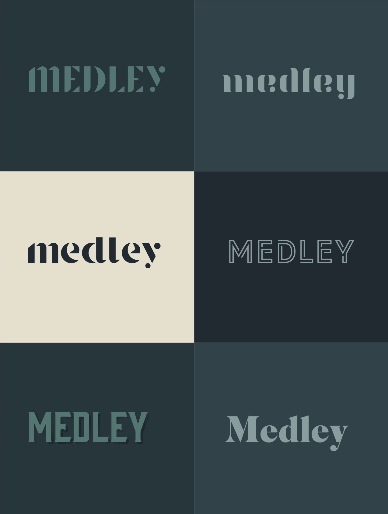
I then take the best comps and move them into a color phase. While the bones of a logo have to work in black and white, color adds another dimension that can either bring a logo to life, or highlight and potential fatal flaws. It is an opportunity to work on logo lock-ups with words and marks living together.

Patrick and I met again, reviewed the comps I have put together, and discussed what spoke to us and why. What elements from the comps are we most visually drawn to? Which one captures our brand pillars and the overarching theme of partnership? While it may seem like this process is time consuming and drawn out, it is actually vital to the longevity of our visual identity, and its ability to accurately represent our small business moving forward. It also gives us the opportunity to further cement our values and mission every step of the way.
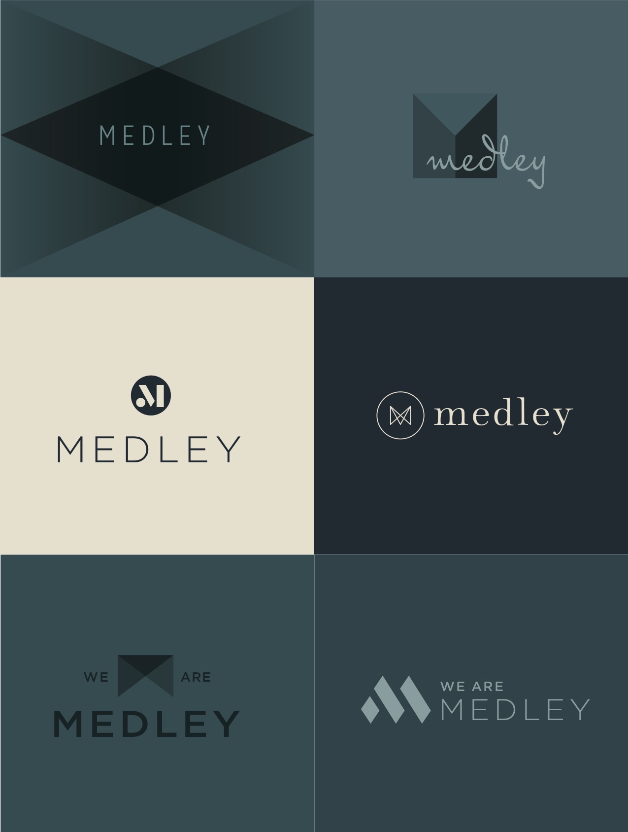
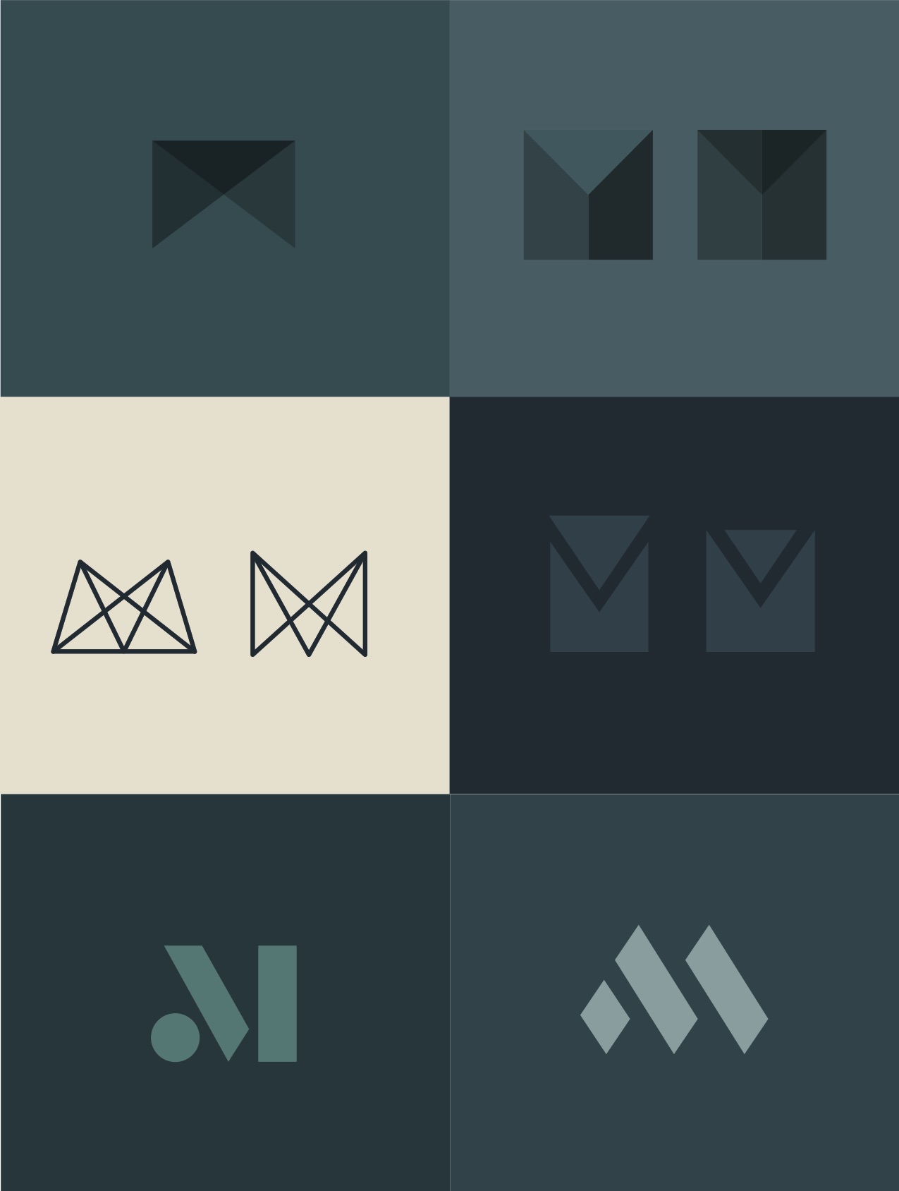
Here you can see we are getting closer to the logo as it exists today. You can also see we have tweaked the color palette we are working with to have more cool gray neutrals rather than warm beige. At this point we have narrowed the field down to three potential designs:
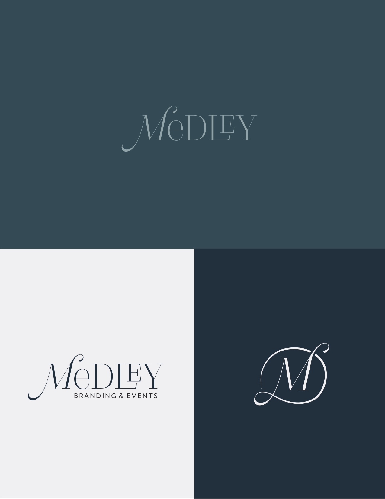
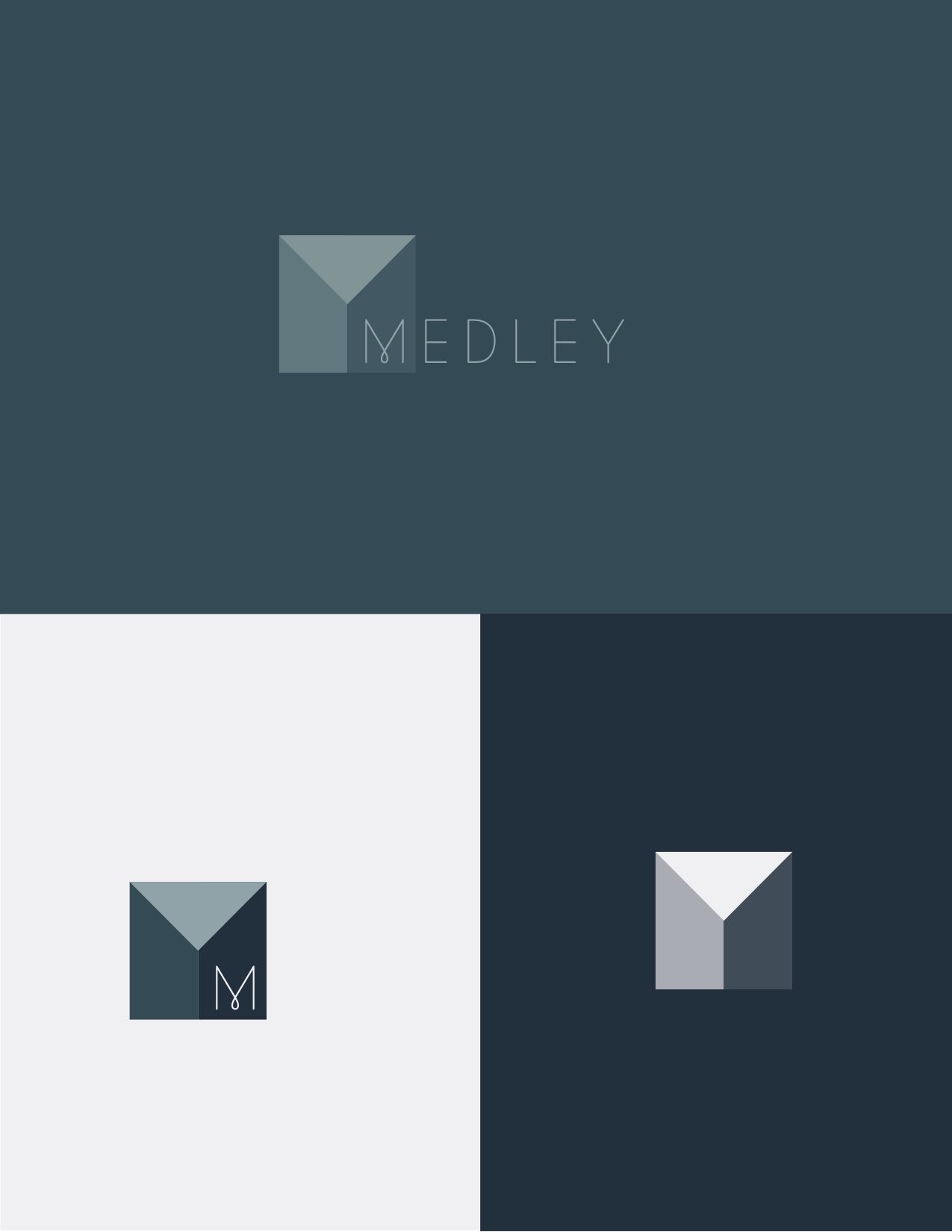
Patrick was really drawn to the M icon from option 2, and while I liked it, I was not immediately sold on how it locked-up with the full name. It just seemed stuck together, and that goes against everything we stand for as a company. I did an exhaustive search of typefaces and lock-ups and was worried that it is just not going to work out.
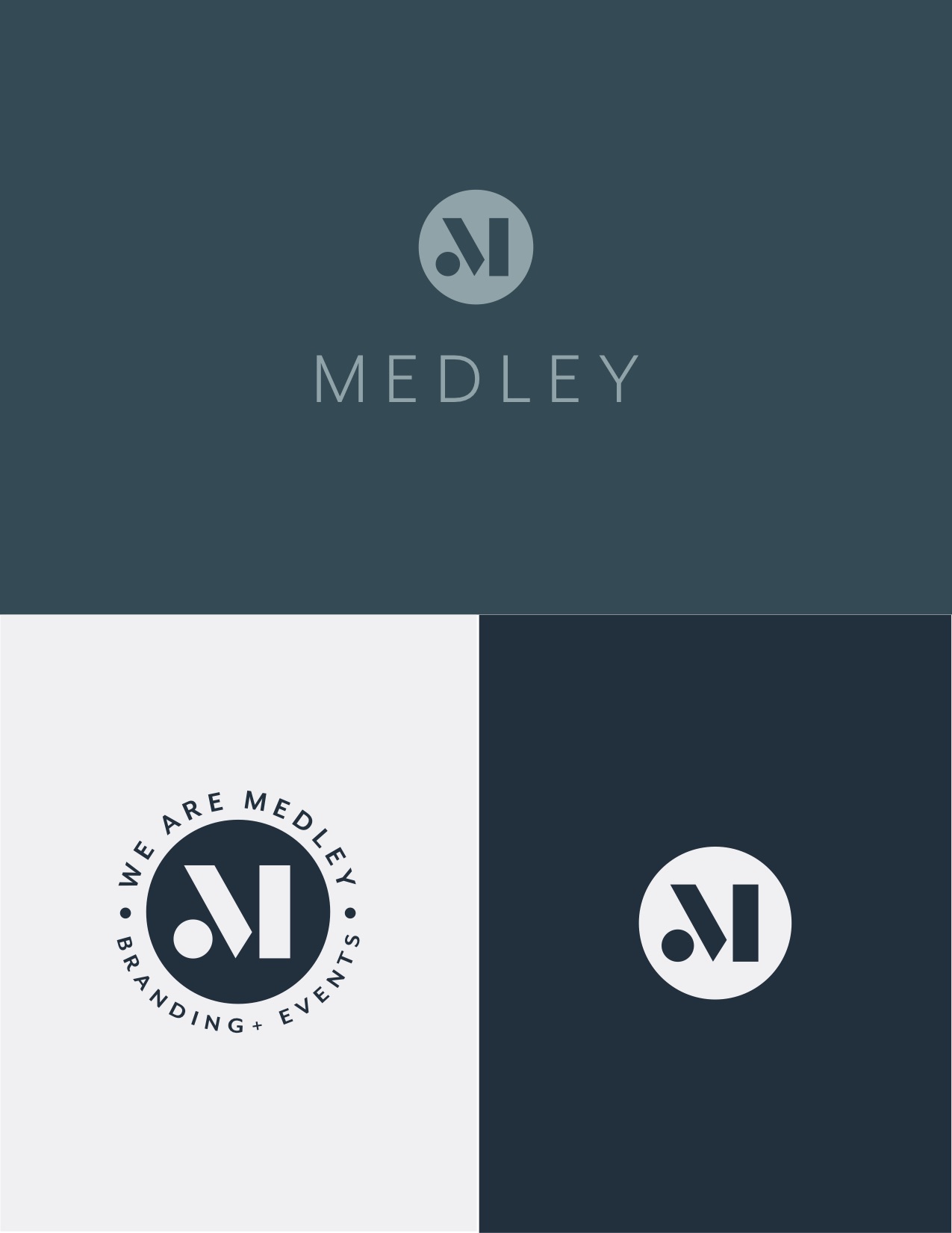
Then, I finally landed on something I thought might just work! With a little bit of tweaking in Illustrator I crafted a logo that has the ability to transform for different formats while keeping its essence so that we can create a consistent visual identity across multiple platforms. That’s what Medley is about.
Now, a little use color to further enhance the logo...
Yes! We have done it. Patrick and I are thrilled with where we landed, and perhaps more importantly, thrilled with how far we have come in solidifying all of the meaning behind our logo.

Creating a logo is not an easy or quick process and it shouldn’t be. It is a critical component of your business and brand, and so much goes into it before you ever put pen to paper. It helps to have a partner to guide you through the process, asking thoughtful questions, pushing back from time to time, all with the intent of ensuring the logo you put forward represents everything you stand for.
In the coming weeks I will take you through the steps to building out our visual identity and how we made each decision with intention, as we did with the logo, to ensure our brand pillars came through, we were creating a consistent visual identity that built upon previous decisions, and that our identity would outlast fleeting trends while having the room to grow and expand as needed.